

Quick Answer
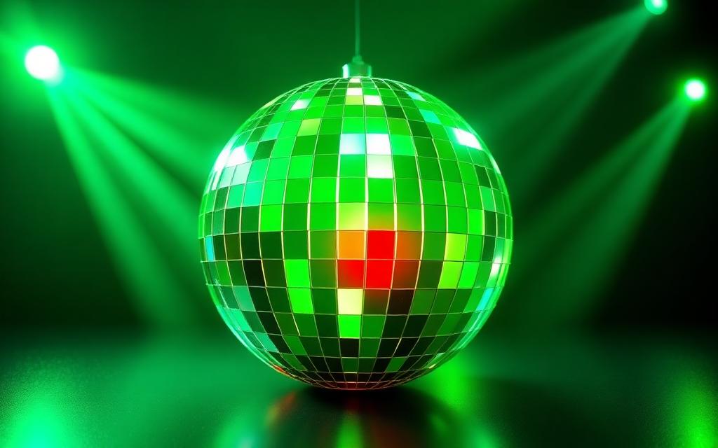
If you opened Spotify on May 15, 2026 and thought your phone had been hijacked by a 1970s nightclub, you are not alone. Spotify rolled out a new app icon, a glossy 3D disco ball, as the lead visual for its Ver.
12.0 update. The change is part of a wider campaign Spotify is calling the Groove Era.
The short answer
If you opened Spotify on May 15, 2026 and thought your phone had been hijacked by a 1970s nightclub, you are not alone. Spotify rolled out a new app icon, a glossy 3D disco ball, as the lead visual for its Ver. 12.0 update.
The change is part of a wider campaign Spotify is calling the Groove Era. The classic three curve sound wave is not gone forever, but the disco ball is now the primary face of the brand worldwide.
Why a disco ball?
For years Spotify's branding focused on the flow of music, the literal sound waves. The new icon shifts the focus from the stream to the scene, the room, the mood.
- Reflection as a metaphor: A disco ball reflects light from every angle, the same way Spotify's AI now pulls tracks from every corner of the catalogue to fit a specific listener vibe.
- Texture and depth: The icon uses a high gloss 3D render, part of the Neu Retro design wave that has dominated 2026, blending futuristic gloss with a nod to seventies club culture.
- Energy: Internal Spotify decks describe the new mark as feeling "alive" rather than passive, a small but deliberate shift in personality.
What is changing inside the app
The icon is the visible tip of a deeper product update. Ver. 12.0 ships alongside two flagship features:
- Spatial 360 audio: An expanded immersive audio mode for compatible headphones, where the multi faceted ball serves as the visual metaphor.
- Live Rooms: Hosted listening parties where friends or fans can join a synchronised playback session, react in real time, and queue tracks together.
The disco ball appears in onboarding screens, the Now Playing background glow, and animated splash transitions when a song starts. The classic green appears in legacy areas like settings and certain web flows.
Is the change permanent?
According to Spotify's Stockholm headquarters, yes. This is not a Pride or seasonal swap. It is the new default mark, and the brand guidelines around it have been distributed to partners and label clients.
How to get the new icon
- Open the App Store (iOS) or Play Store (Android).
- Search for Spotify and tap Update.
- Once installed, the new disco ball icon replaces the old one on your home screen automatically.
- On desktop, restart the app after the auto update for the new splash screen to apply.
User reaction
The internet, predictably, is split. Fans love the bold, vibrant feel and the way the icon glows when music is playing in the background. Critics call it busy and miss the sleek minimalism of the old wave.
Either way, the Spotify disco ball is now the face of the brand. If you do not see it yet, you are one App Store update away.
The takeaway
Spotify's 2026 rebrand is not a glitch and not a tribute. It is a deliberate Groove Era refresh that ties the visual identity to immersive audio and social listening. Update the app, get used to the gloss, and expect to see the disco ball everywhere from billboards to playlist art for the rest of the year.
The Cultural Power of a Single Symbol
Logos do more than identify a company. They carry mood, era, and intent. Spotify's circular mark with its three curved sound waves was always meant to evoke broadcasting, but in 2026 the design team has leaned harder into the disco ball reading because the platform's identity is shifting toward shared, social listening.
The disco ball is a perfect cultural shorthand. It represents movement, light, and the collective experience of music on a dance floor. By embracing that association, Spotify positions itself less as a passive jukebox and more as the engine behind moments people actually live through.
Why the Comparison Took Off
Social media users were the first to popularize the disco ball nickname, and Spotify's marketing team noticed. Instead of resisting the meme, the company folded it into seasonal campaigns, Wrapped visuals, and in-app artwork. That willingness to play along turned a fan observation into a brand asset.
The shape also photographs beautifully against neon, glitter, and reflective surfaces, which are the textures dominating 2026 pop aesthetics. The logo now feels native to the visual language of the moment rather than a relic of early 2010s flat design.
Design Choices That Reinforce the Idea
- Subtle gradient shading on the waves to mimic light bouncing off a faceted sphere.
- Animated app icons during major releases that shimmer and rotate.
- Marketing photography that places the green circle next to literal disco balls.
Each of these touches is small on its own, yet together they cement the new reading without forcing Spotify to redraw the core mark. That is smart brand stewardship, evolving meaning without burning equity.
What It Signals About Spotify's Direction
The disco ball framing fits a broader product strategy. Jam sessions, collaborative playlists, live listening parties, and AI hosted mixes all push the service toward communal music rather than solo headphone time. A symbol that evokes a dance floor lines up neatly with that roadmap.
For competitors, the lesson is that a logo's meaning is never fully fixed. Audiences will assign their own associations, and the brands that win are the ones that listen, adapt, and amplify the readings that serve their future.